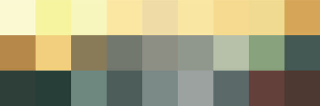
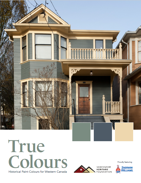
The True Colours palette contains 40 original paint colours that were used on houses and buildings in Vancouver from the 1880s to the 1920s, often chosen by the first owners and builders. It is a valuable tool when the goal is to restore a house or building to its original appearance or selecting a combination and placement of colours that reflect its early history, construction and residents. The palette can also be useful in identifying the placement of light and dark colours to complement the architectural style. For some houses and buildings, a colour scheme from a later period might have greater significance in reflecting the history and heritage values, and may be considered in a restoration or rehabilitation plan for the site.
The colours were identified through sampling and analysis from many different houses and buildings. They were named for the streets and neighbourhoods where they were first documented, often reflecting the different eras of development, architecture and changing tastes from the 1880s to the 1920s.
Hard copies are available at the VHF office.
Scroll down to see examples of historical colour schemes that have been implemented in different neighbourhoods around the city.
Thank You to our Program Sponsor
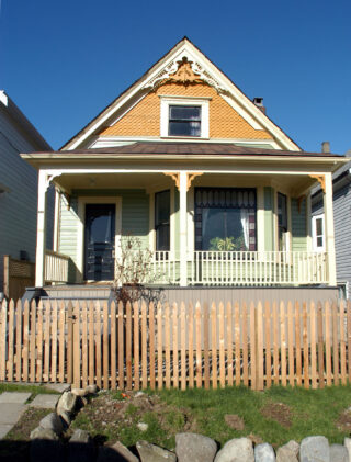
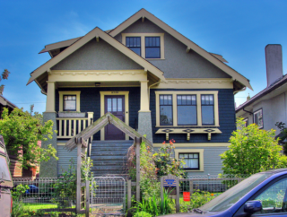
True Colours Grant - Vancouver Green, Edwardian Buff, Gloss Black
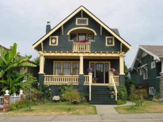
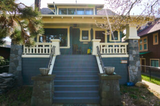
A recipient of the True Colors Grant (Comox Green, Edwardian Buff, Haddington Grey), we notice the beautiful contrasting shades of blue-green and cream with a grounding tone for the door. We see much of the exposed woodwork along the prominent side-gabled roof, and the extensive porch in this variation of the Side-Gabled Craftsman style. Knee brackets are seen throughout the posts holding up the sleeping porch's shed roof and the main roof boasts wide eaves and is held by square porches. This is a very picturesque version of this home style.
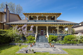
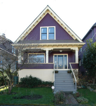
1145 Union - Victorian Peridot, Edwardian Buff, Comox Gold, Gloss Black
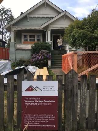
True Colours Grant Recipient 2015. Body – Harris Green, Trim and Watertable – Edwardian Bufff, Sash – Gloss Black, Gable – Craftsman Brown, Deck and Stairs – Edwardian Porch Grey.
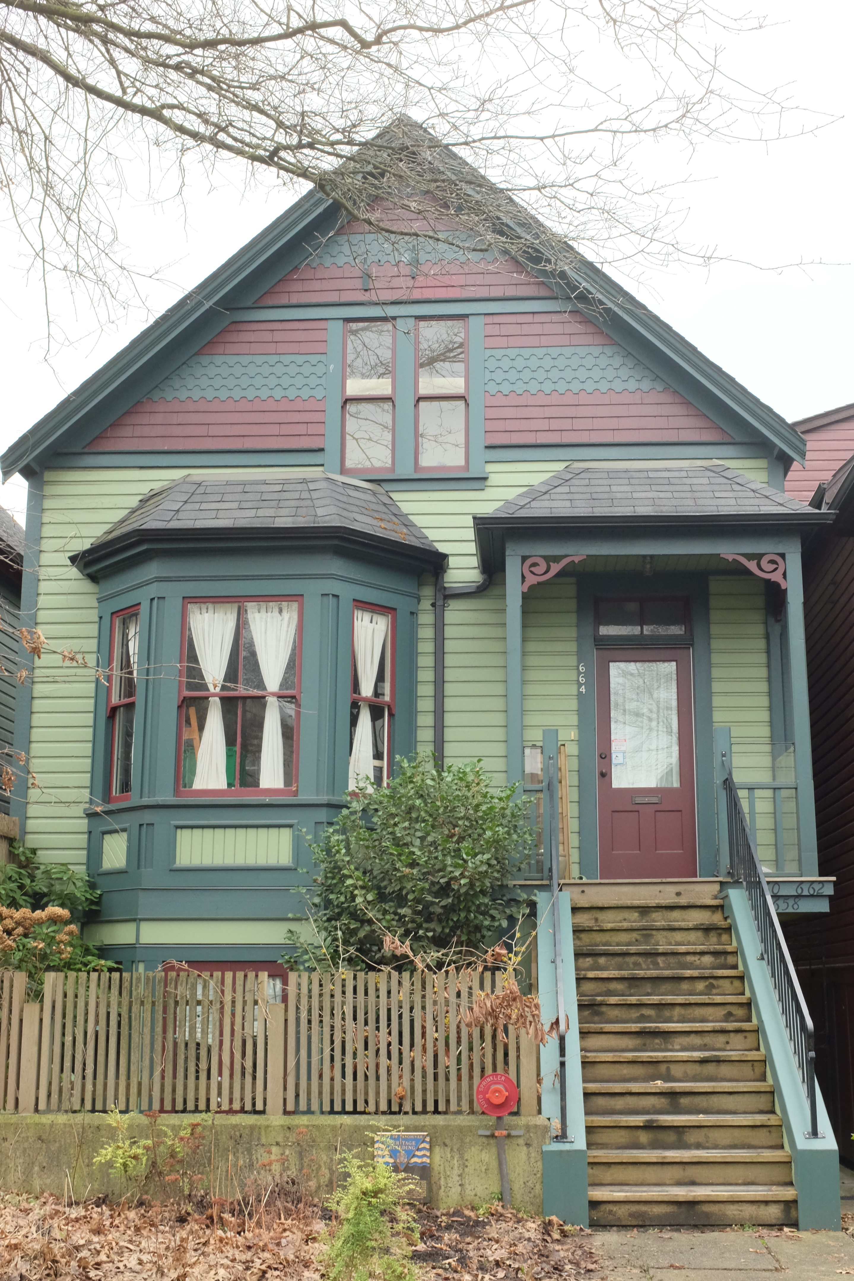
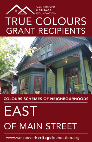
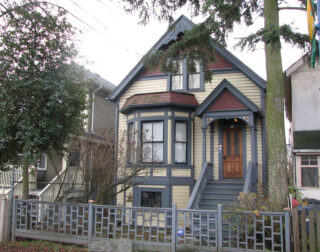
664 E Georgia Street - Victorian Peridot, Hastings Red, Pendrell Green, Gloss Hastings Red
3589 Commercial Drive - Kitsilano Gold, Comox Green
656 East Cordova - Edwardian Buff, Strathcona Red, Edwardian Porch Grey, Gloss Black
827 East Georgia - Edwardian Buff, Edwardian Porch Grey, Pendrell Red, Gloss Black
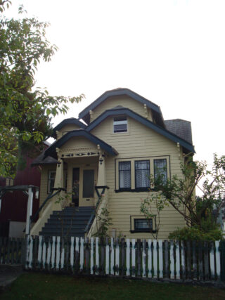
2426 East 23rd - Edwardian Cream, Vancouver Green
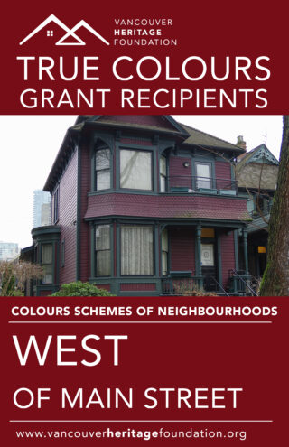
3044 Point Grey Road - Edwardian Pewter, Oxford Ivory, Gloss Black
2728 Pandora - Harris Green, Mount Pleasant Buff, Haddington Grey, Gloss Black
1932 Ferndale - Hastings Red, Edwardian Buff, Gloss Black
True Colours Grant - Vancouver Green, Edwardian Buff, Gloss Black
A recipient of the True Colors Grant (Comox Green, Edwardian Buff, Haddington Grey), we notice the beautiful contrasting shades of blue-green and cream with a grounding tone for the door. We see much of the exposed woodwork along the prominent side-gabled roof, and the extensive porch in this variation of the Side-Gabled Craftsman style. Knee brackets are seen throughout the posts holding up the sleeping porch's shed roof and the main roof boasts wide eaves and is held by square porches. This is a very picturesque version of this home style.
1145 Union - Victorian Peridot, Edwardian Buff, Comox Gold, Gloss Black
True Colours Grant Recipient 2015. Body – Harris Green, Trim and Watertable – Edwardian Bufff, Sash – Gloss Black, Gable – Craftsman Brown, Deck and Stairs – Edwardian Porch Grey.
664 E Georgia Street - Victorian Peridot, Hastings Red, Pendrell Green, Gloss Hastings Red
3589 Commercial Drive - Kitsilano Gold, Comox Green
656 East Cordova - Edwardian Buff, Strathcona Red, Edwardian Porch Grey, Gloss Black
827 East Georgia - Edwardian Buff, Edwardian Porch Grey, Pendrell Red, Gloss Black
2426 East 23rd - Edwardian Cream, Vancouver Green
3044 Point Grey Road - Edwardian Pewter, Oxford Ivory, Gloss Black
2728 Pandora - Harris Green, Mount Pleasant Buff, Haddington Grey, Gloss Black
1932 Ferndale - Hastings Red, Edwardian Buff, Gloss Black
History
When it started, True Colours was a unique program in Canada. From its inception in 1999 until 2018 the True Colours Grant Program awarded close to $100,000 in grants and Benjamin Moore distributed over 2,000 gallons of paint to more than four dozen paint projects. The program won both City of Vancouver and Province of British Columbia Heritage Awards.
Since 2022, Sherwin-Williams has been the sole corporate sponsor of the program, providing paint grants and assisting with the expansion of the palette. The 2022 update saw the addition of 6 new colours which had been found on buildings in Vancouver since the the initial 1999 launch. This expanded range is available only at Sherwin-Williams.
Funding to support repainting in the True Colours Historical Paint Palette is available for eligible projects through the Heritage Conservation Grant Program, select grants will also recieve complimentary paint generously provided by Sherwin-Williams.
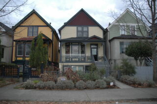
The True Colours grant offered by VHF only tells part of the story. There are many building owners who paint their buildings in the True Colours palette, regardless of receiving a grant from VHF. The impact of True Colours can be seen in neighbourhoods throughout Vancouver.
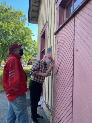
Donald Luxton, the Heritage Consultant who volunteered hundreds of hours scraping Vancouver homes to uncover these original paint schemes, reflects on the True Colours Program.
“The True Colours program has been a remarkable experience. When the program started, we could not have anticipated the depth and richness of the historical palette that we would uncover, the interest that this would generate among homeowners and the general public and the ongoing desire for information about authentic heritage colours. What I have learned through this program is how carefully colours were chosen to highlight different types of historic architecture, and how paint technology and appearance was so well understood by the designers and builders of the time. The use of colour was not arbitrary, and was an integral part of design. The restoration of authentic colours has provided another level of accuracy and sophistication in our understanding of our heritage buildings.”
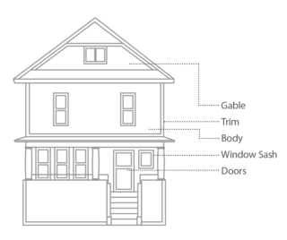
Colour Placement
The colours in the Palette were used in particular combinations depending on the style of the house. Some colours were only used for trim or window sash while others were applied to the main body of the house. Following this pattern of colour placement will help provide an authentic colour scheme.
Homes of the Victorian Era typically had a mid-tone or light body colour with a darker trim and a dark window sash. Homes of the Edwardian Era were the opposite, with a mid-tone to dark body colour, a light trim and a dark or black window sash.
-
Body
Main exterior walls of the house that are usually wood shingles, siding or stucco and can include the gable ends. Body colours from the True Colours Palette:
- Dunbar Buff
- Edwardian Cream
- Mount Pleasant Buff
- Strathcona Gold
- Comox Gold
- Kitsilano Gold
- Mount Pleasant Tan
- Bute Taupe
- Victorian Peridot
- Comox Green
- Vancouver Green
- Harris Green
- Pendrell Verdigris
- Lonsdale Green
- Edwardian Pewter
- Point Grey
- Harris Grey
- Cambie Olive
- Strathcona Red
- Mellish Rust
- Pendrell Red
- Mellish Mahogany
- Craftsman Brown
- Wilmar Brown
- Harris Brown
-
Trim
This can include trim around windows, columns, fascia board, deck and porch railing, brackets, water table board, soffts and rafters. Trim colours from the Palette:
- Oxford Ivory
- Classical White
- Craftsman Cream
- Pendrell Cream
- Harris Cream
- Dunbar Buff
- Edwardian Buff
- Edwardian Cream
- Mount Pleasant Buff
- Strathcona Gold
- Kitsilano Gold
- Bute Taupe
- Pendrell Green
- Tudor Brown (half-timbering)
-
Window Sash
The window sash framework contains a sheet of glass or a number of window panes in a window or a door. Sash colours in the Palette:
- Comox Green
- Edwardian Pewter
- Strathcona Red
- Mellish Rust
- Hastings Red
- Mellish Mahogany
- Strathcona Mahogany
- Alhmabra Green
- Tudor Brown
- Gloss Black
-
Other
Porch Floor & Stair Treads
- Edwardian Pewter
- Harris Grey
- Edwardian Porch Grey
Doors
- Typically unpainted and varnished
- Gloss Black, or
- Matches the sash colour
Stucco details
- Typically unpainted
- Haddington Grey can be used to emulate the original finish where stucco has been painted
- Classical White on later buildings
Examples
Click on a neighbourhood to see examples of historic paint colour schemes.